A visit to a top tailor remains one of the most personal and intimate experiences available to a customer. The process of picking out a great suit or shirt benefits from having an expert to guide you through the various fabric options, while proper measuring is essential to ensure optimal fit. At a time when the retail industry is undergoing an unprecedented revolution, with online purchases steadily replacing in-store sales, the tailor is one of the few places it’s still essential to visit for a satisfactory pre- and post-purchase experience.
When English Cut decided to establish its first dedicated store on Marylebone’s Chiltern Street in London, it was determined to pre-serve the heritage of the tailoring experience by creating a space with a welcoming and premium feel. To oversee the store’s development, founder Tom Mahon approached retail-design specialist Philip Handford, whose Shoreditch-based agency Campaign has produced innovative retail solutions for some of world’s leading fashion brands, including Phillip Lim, Burberry and Alfred Dunhill.
According to Handford, the designer-client relationship got off to a positive start, with several early meetings continuing at the local pub. “The classic thing when you go to see a tailor on Savile Row is that they take you to the pub for a pint and a Scotch egg,” says the designer, who was also impressed early on by Mahon’s vision for the company. “I just fell in love with the way Tom spoke about the brand,” adds Handford, “and I was excited by the premium nature of the business. I could see there was an opportunity to create an amazing level of customer service around a great product.”
Handford founded Campaign in 2008, after spending several years working with Burberry chief creative officer Christopher Bailey on a store ethos and design language applied across its global concessions. His experiences designing retail environments, ranging from flagship stores to pop-ups, have instilled in him a strong belief that intelligently designed bricks-and-mortar stores remain valuable to some consumers: “It’s still an important part of people’s lives to have somewhere they can go to play with the product, even if they don’t necessarily buy something that time around.”
Campaign’s projects seek to translate Handford’s enthusiasm for installation art into spaces that deliver memorable and engaging experiences. Previous examples have included a 2,600 sq m menswear department store in the Chinese city of Wuxi, featuring a dramatic three-storey atrium lined with brass archways, and a carefully curated gallery-like interior for the Selfridges Designer Studio in London, where artist-designed follies provide unique spaces for displaying products. When working with independent brands, the studio attempts to pinpoint what makes a company unique and encapsulate these characteristics in a physical space.
Back in London, Campaign – in close collaboration with English Cut’s creative team – developed a design for the Chiltern Street store intended to make the customer feel instantly at ease and confident that they are in expert hands. The store’s visual language takes the ideas of tradition and craftsmanship that are key to English Cut’s identity as its starting point and introduces quirky modern details to represent the brand’s inherent sense of humour.
From the street, the shopfront presents an understated and timeless grey facade, with hardware and signage picked out in brass. At the time of opening, the large shop window accommodated an elegantly attired tailor’s bust and a simple display of frames containing products suspended from the ceiling. The display’s openness ensures the view into the store is maintained, making it feel accessible and allowing passers-by to see what’s going on inside.
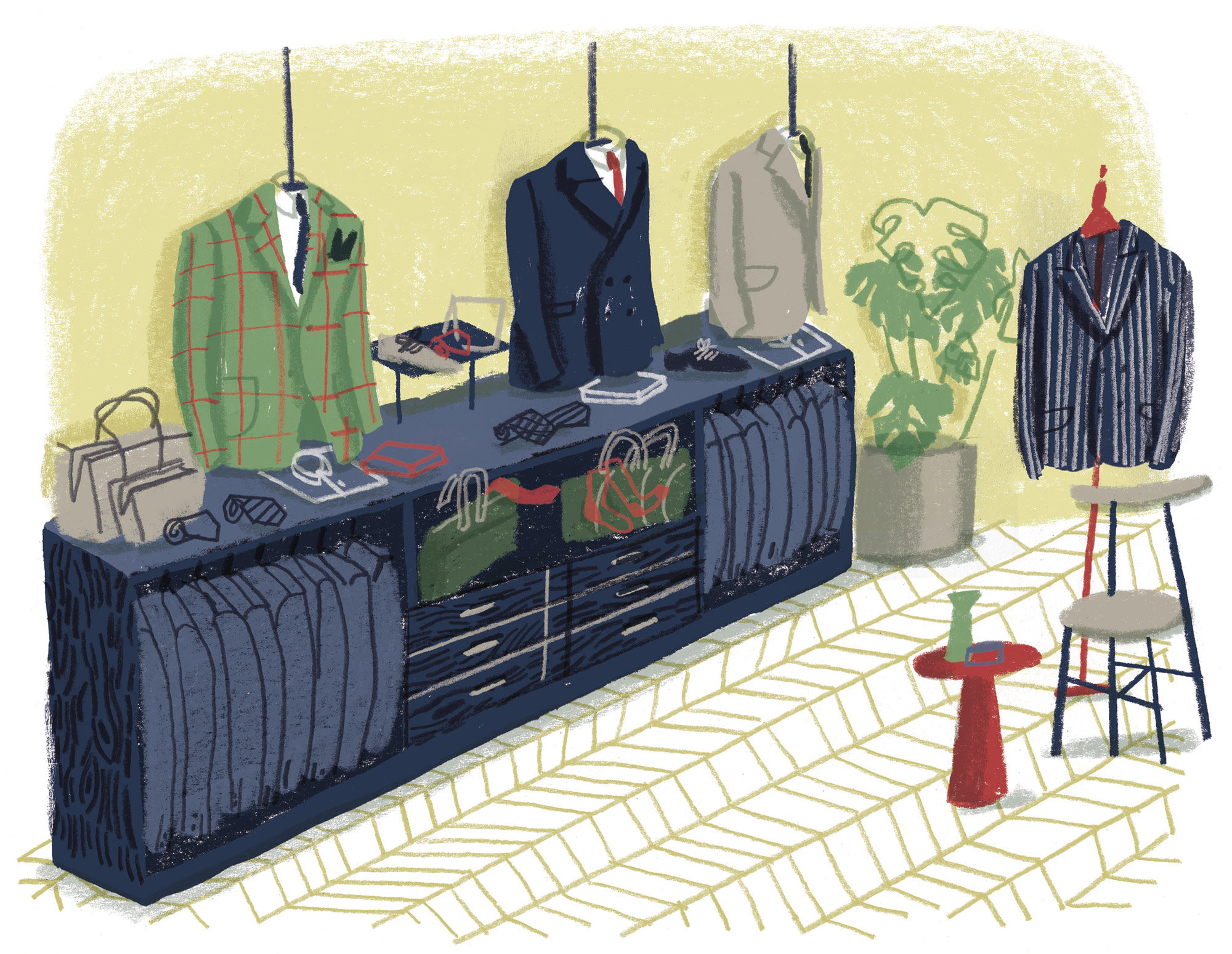
The main shop floor has a light and warm feel, thanks to the timber chevron flooring and wooden panelling of the display wall. Dark timber-veneer joinery, a black-painted metal balustrade and brass accents provide a contrast to the predominantly light palette. At the rear of the space, warm metallic panels form a screen for the fitting room, while a statement lighting fixture adds an element of modern glamour. References to heritage are achieved through clever details like the addition of simple beading to recreate the look of a classic panelled ceiling.
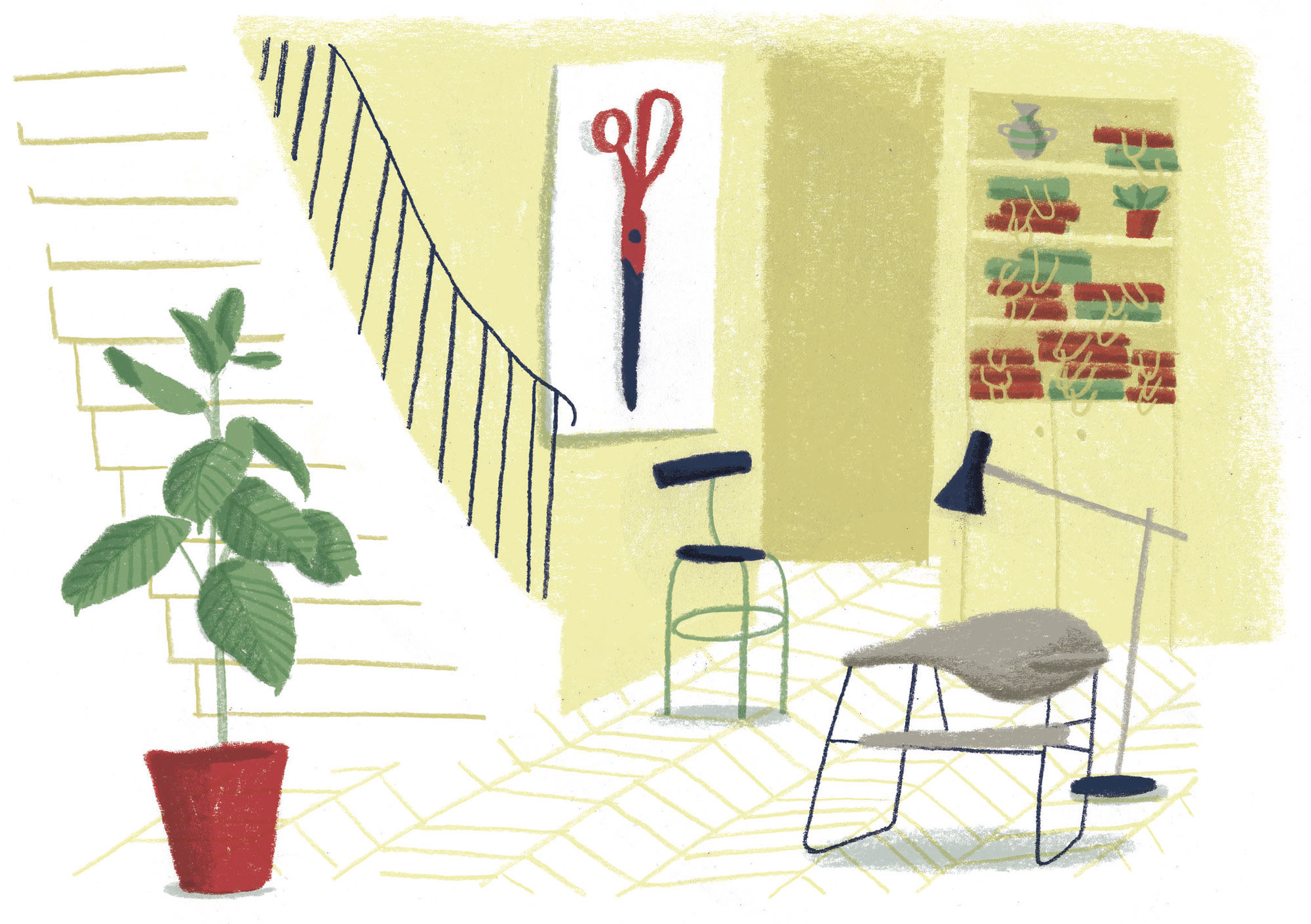
The staircase descends to a slightly larger VIP area in the basement, where more premium fixtures and comfortable furniture create a lounge-like feel. “We were looking at increasing the dwell-time of the customer in this area,” says Handford, “so we upped the level of comfort to ensure a more luxurious experience is possible down there.”
At the centre of the room is a marble-topped display table, while a fitting area containing a triptych mirror at the rear is enveloped by a velvet curtain suspended from a brass rail. The front of the space accommodates a work table illuminated by a skylight, on which samples stored in the adjacent fabric library can be presented. This underground den is carefully styled to invoke the sort of relaxed atmosphere that facilitates dialogue and trust between the customer and the tailor or salesperson. “The room is designed to empower that expert,” adds Handford, “providing space to lay out fabrics and good lighting, as well as a convivial feel.”
The store’s overall design offers the ideal backdrop for the experience of commissioning bespoke tailoring. It provides the space, tools and ambience the tailor needs to guide the customer through the process, and ensures every moment is spent in a comfortable and attractive environment.
While many other retailers desperately search for ways to keep customers coming back for another bricks-and-mortar experience, Handford remains confident that shopping online is no match for the experience of visiting English Cut’s new home and engaging firsthand with their expert staff. “English Cut will be safe because of the level of service they’re offering and because people need to come and play with the product,” he concludes. “There’s a real reason for them to go to this store.”
